I noticed this term a few days ago in Ion Interactive’s newsletter and thought it was interesting. Landing pages are an important—and too often ignored—part of the conversion process. Improving them is a subject that should always be of interest. So, as usual, I set out to explore.
The first thing I found out is that the term doesn’t seem to be in use on sites like Grokdot.com, which specializes in conversion issues, or Omniture, which touts optimization of various aspects of emarketing. What I did find was a number of services that help marketers test their landing pages. Testing is always good, whether the pages are social or not.
So I went back to Ion to find their definition. Content from their newsletter (July 08) answered that:
Subscriber question: What is a social landing page?
Answer: Social landing pages are landing pages that include social networking features. They bring together marketer-managed marketing and social interactivity.
In the news release for their LiveBall product, Ion’s president Scott Brinker adds, “A landing page can serve as a ‘connector’, bringing together people with a specialized, shared interest.” The press release goes on to describe 7 benefits of adding social features to a landing page that include recipient interaction, brand development and lower bounce rate.
These are interesting, but I wanted some examples. Their LiveBall product demo is interesting, although it stopped working about half way through the second step. It makes it clear, though, that the Ion product is marketer-controlled, and I’m always a fan of DYI.
But I’m still looking for examples, so I did something I don’t usually do. I clicked on some PPC ads. (I’m such a considerate customer that I always use the free search listing link if it’s available.) I’ve used the Vertical Response product and like the company, so I looked to see what they had and found a good landing page. After clicking on several banners on several portal sites I found an HSBC ad on the NYT site that had a good landing page.
The search alone is instructive. A lot of companies are paying for advertising and not using landing pages associated with their ads. Some of the ads took me to product pages, which were at least relevant. Others just took me to a home page. Shameful!
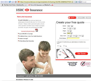
 Take a look at what I did find. I’m showing the landing page and the home page. Both landing pages have URLs that prove my point, but I’m showing the home page anyway to make the point that the landing pages take visitors more directly into relevant product information than do home pages.
The Vertical Response page is long, so I cut in in half and put it back together so you could see it all. It’s not particularly creative, but it gets their Create > Send > Track message across, has some promotional content, presents a compelling offer (500 free emails), and lets the viewer sign up directly on the landing page. Maybe not “creative,” but it really does the job. You could get to sign up from the home page, but you’d have to click through to the email page, where you’d find much of the same information, but an offer for only your first 25 emails (small list!). Vertical Response clearly has a landing page that’s meant to maximize the conversions from its PPC advertising. HSBC’s term life insurance landing page (if you could see the URL, you’d see they call it the “simplestart” page) is even more interactive. It allows you to select profile characteristics and request a quote, again, right from the landing page. HSBC is a more complex enterprise and it’s home page represents that. It’s insurance main page is remarkably unattractive, but it allows you to get quotes for a variety of
 insurance, including term, which was featured when I wrote this post, presumably to integrate with the current banner advertising campaign.
Neither of these had “social” components in the social networking sense, although other components are possible. Ion’s blogs, for example, cover issues like use of widgets in online advertising and news feeds on landing pages.
So, while I’d call these landing pages “interactive,” instead of “social,” and there’s a large frontier to be explored either way. As you explore, don’t forget to test every step of the way. There’s so much a marketer can do; the question should always be “what should I do in order to be successful?” Test and find out!
Wednesday, August 6, 2008
Social Landing Pages?
Posted by MaryLou Roberts at 12:14 PM
Labels: interactive marketing, landing pages, online advertising, social media, testing
Subscribe to:
Post Comments (Atom)


No comments:
Post a Comment